anna-08-lookingOutwards

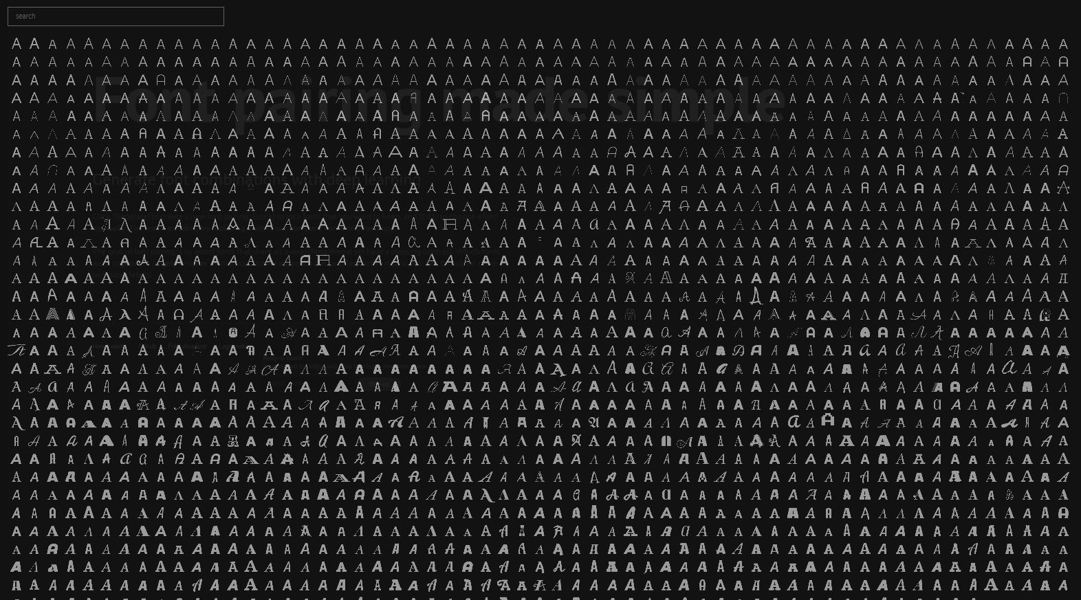
Okay, where was this when I lived and breathed graphic design? The project I’ve chosen to highlight is titled Fontjoy, by Jack Quiao, which generates font pairings. Its aim is to select pairs of fonts that have distinct aesthetics, but share similar enough qualities for them to be functional as a font pair. I don’t quite understand how it all works, but the fact that there’s a neural net out there that has fonts categorized on a scale of most to least similar warms my heart, if not for any reason other than that someone has made the thing that I’ve very much wished existed every time I go to select fonts on a document.

Use the tool here.

anna-pix2pix

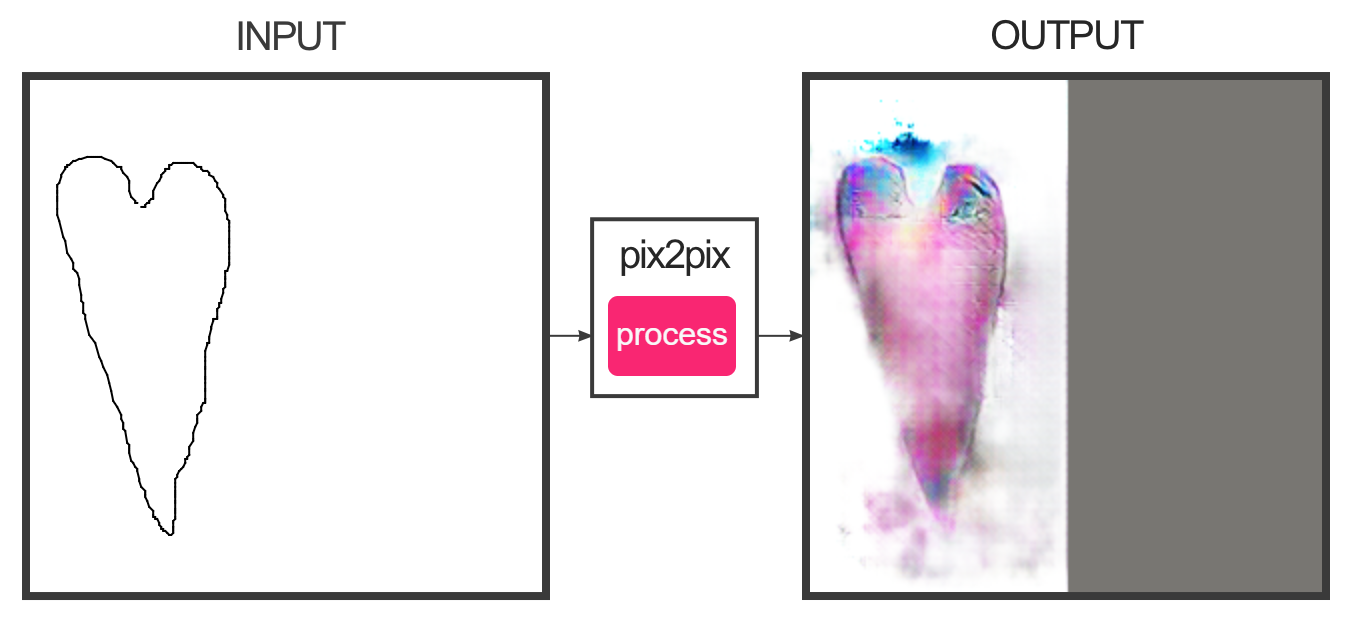
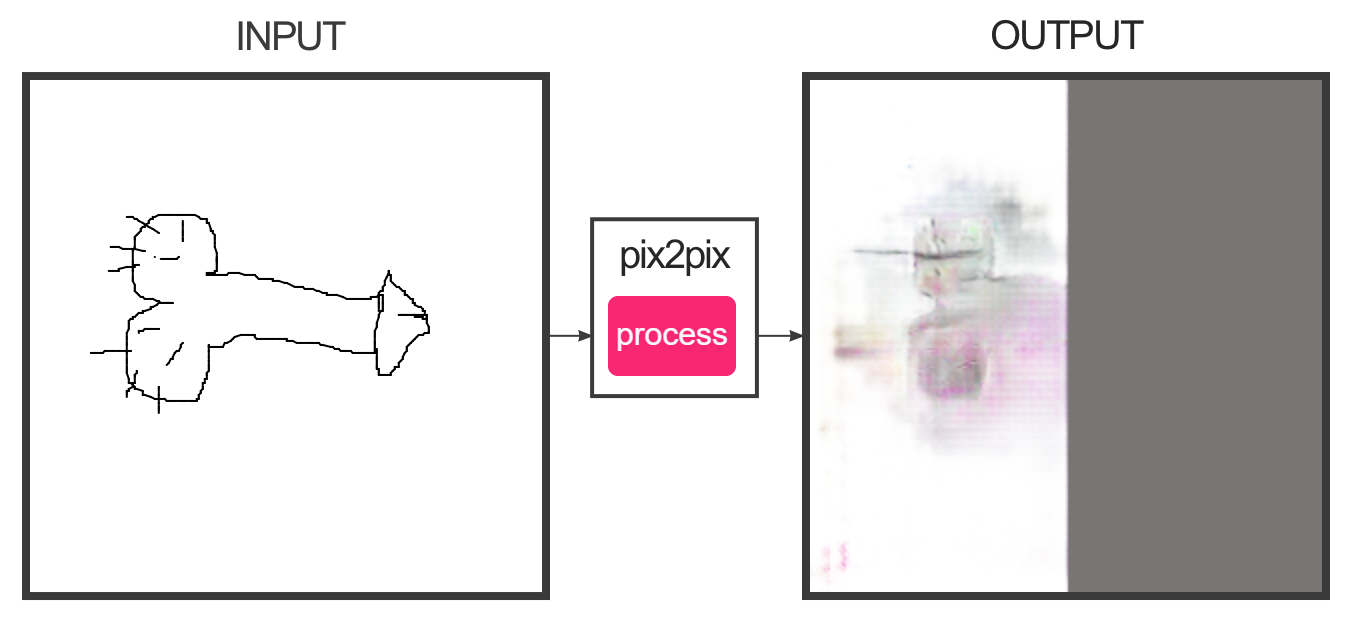
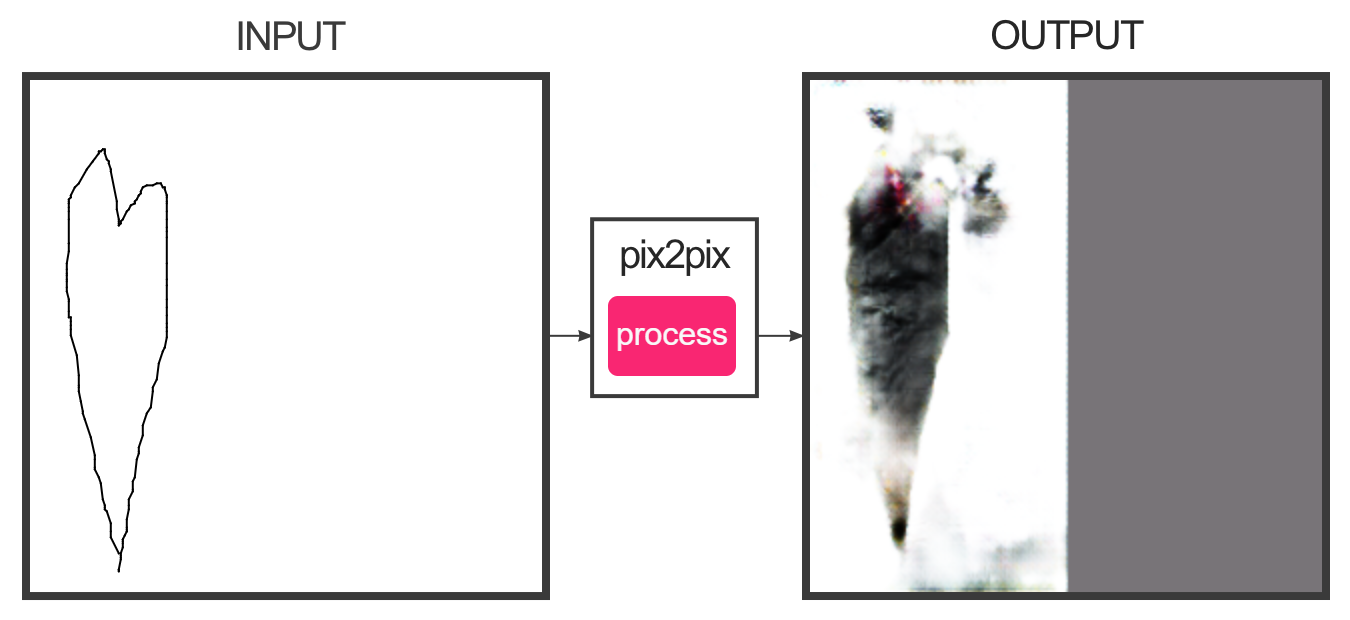
Okay, so, my computer had issues making more than fifty percent of a whole image on pix2pix, but I had fun? I think, honestly, that it’s so great that I live in a time where I get to see a computer make a Nightmare Cat based on a few lines I drew. (nightmare cat is the first image, despite not looking like a cat)

anna-memorydream

Find my game here

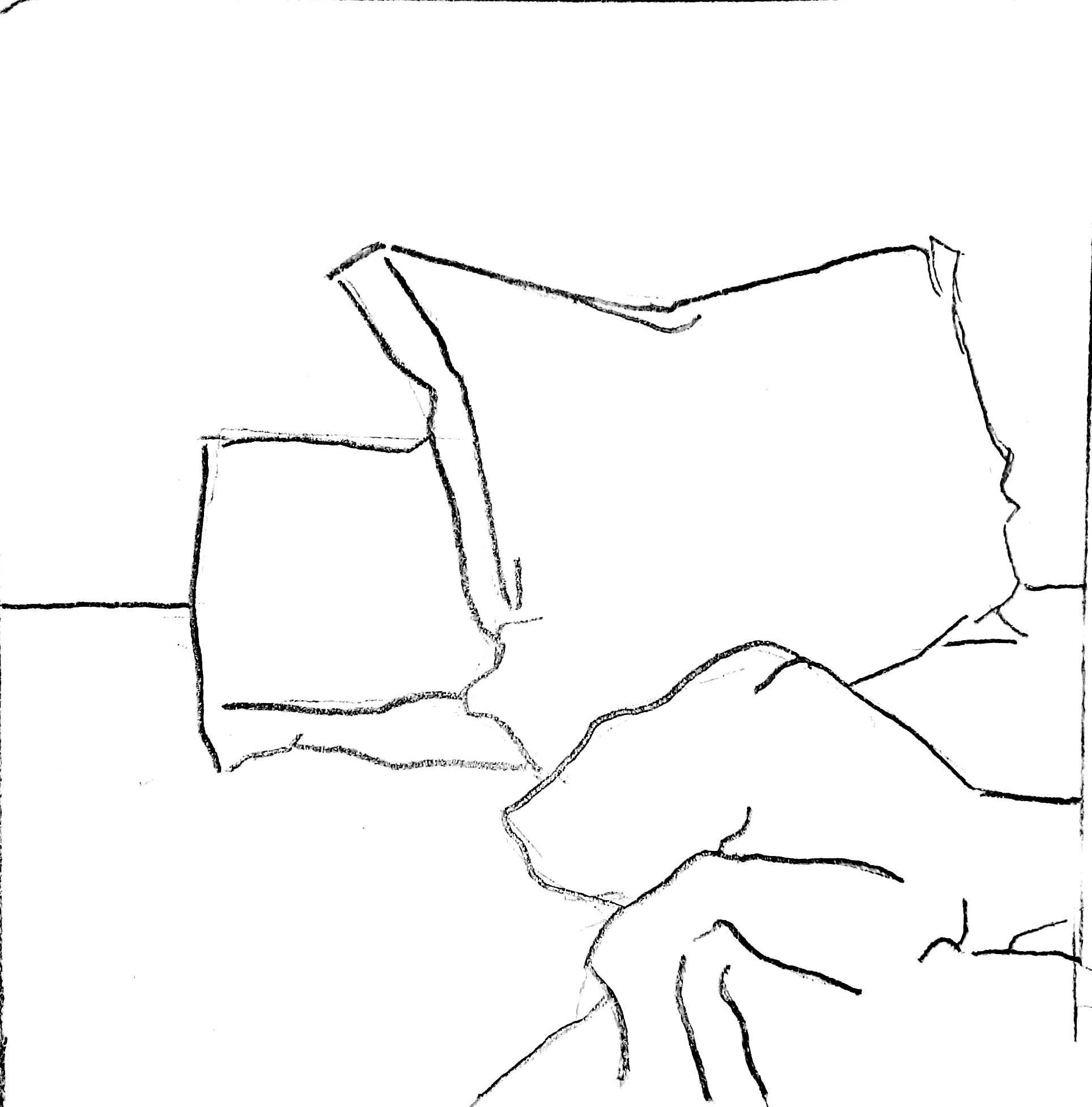
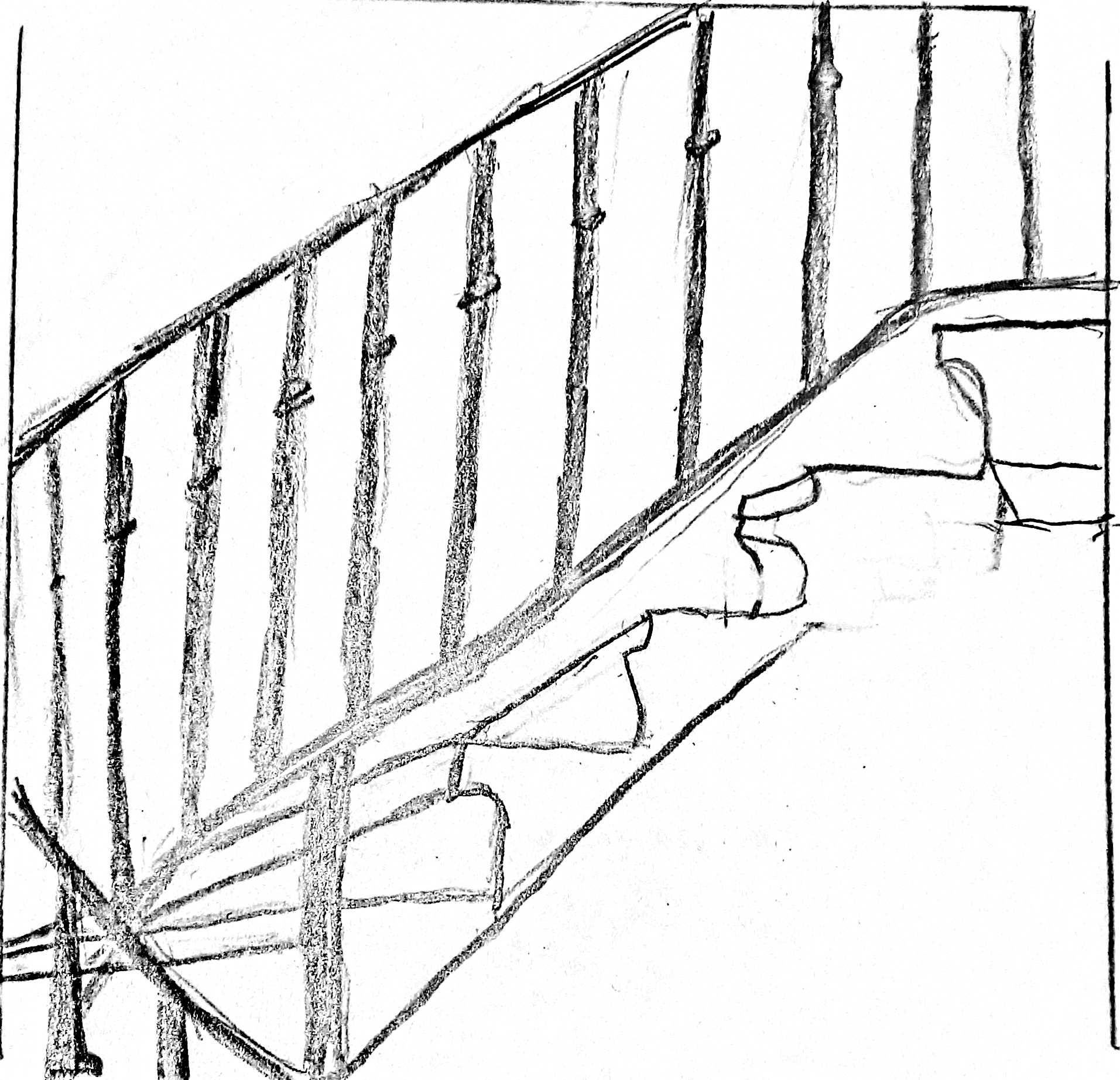
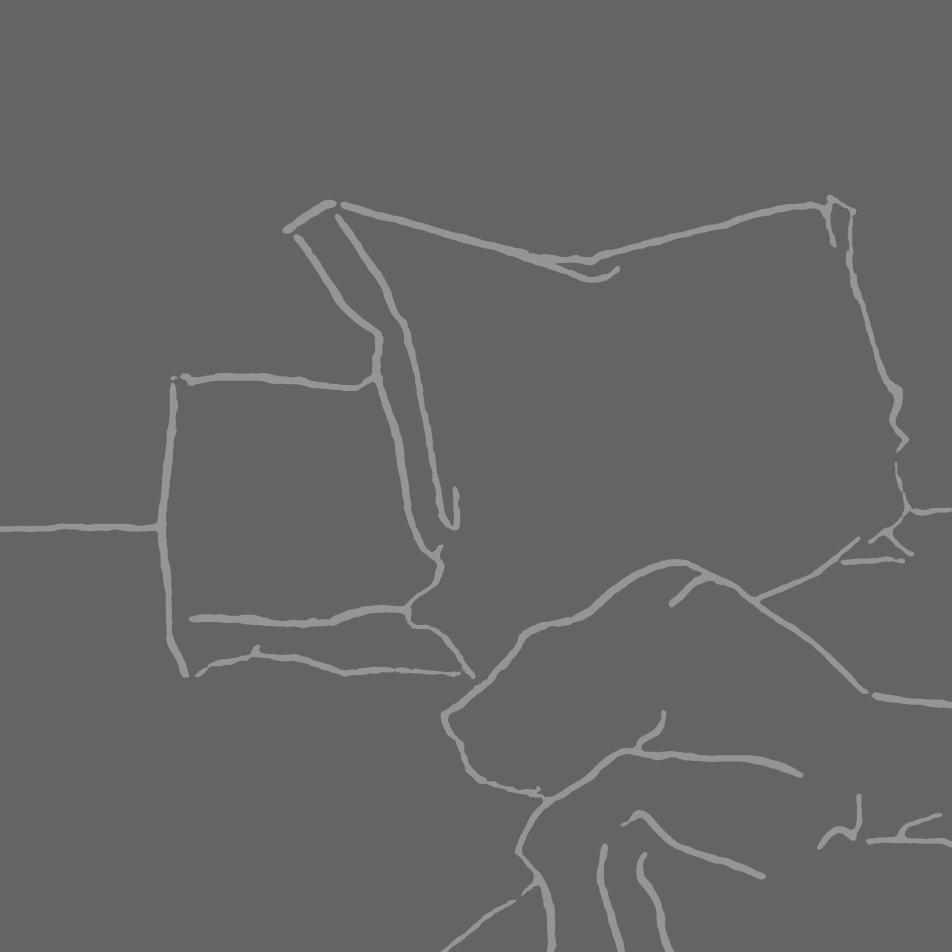
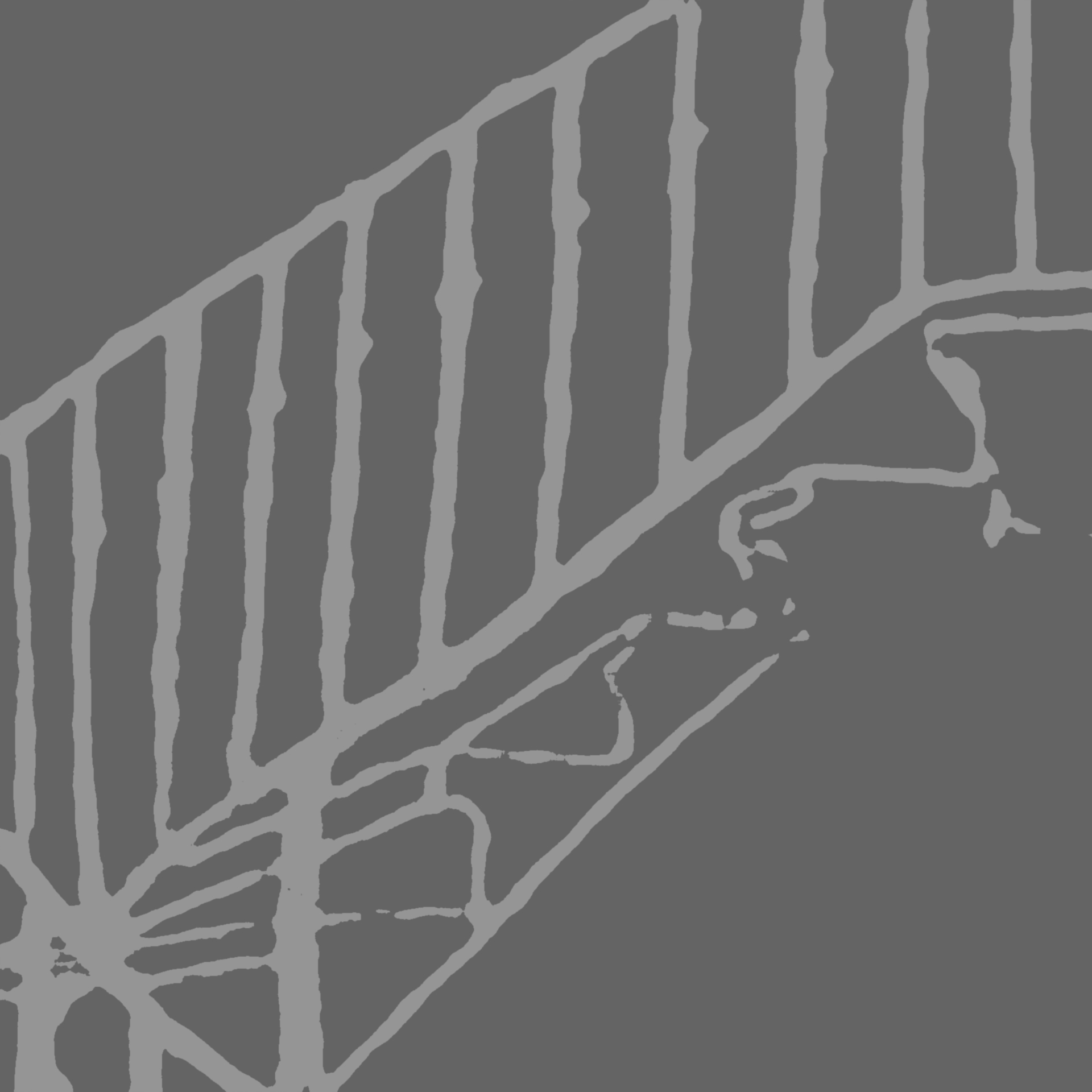
To start  with, here are some sketches I did for the backgrounds and edited, then uploaded to pixsy:

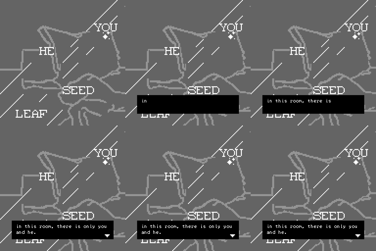
For this game I decided to construct a narrative that melds together my childhood experiences and dreams I’ve had related to recent personal events. I wanted to be poetic in my speech, and use words as a visual element even though bitsy seems to be a bit more picture-oriented. I wanted muted colors for the background, so I chose grays.

I had fun with this, but working with pixels was a challenging new experience. I could use feedback on the quality of the writing, the clarity of the background images, and whether this seems melodramatic or not because I don’t want my art to come across that way.

anna-lookingOutwards07

Bitsy! Fun game/narrative making with pixels! That’s what I’m gathering so far. People are making lots of pretty and intricate stuff with only pixels, and I find that cool but also intimidating since I am like, .006 percent familiar with making pixel art in general. Clicked on one and it had sound, which surprised me, but maybe it shouldn’t have. All of these games seem intense, either by like, concept or purely by attention to detail in the visuals. Kinda struggling to find more than, like, five or so on the first page that don’t have to deal with something sad or horror related in their content. Is horror stuff just a thing among bitsy makers? I love the aesthetic, but I could do without any jumpscares at the moment so I don’t exactly have the courage to delve into actually looking at the game.

Okay, there’s one that looks all sunny-ish. Let’s give it a go. Okay, it’s cute but it’s also repeated the same passage like five times so I’m wondering if I did something wrong. Now I’m on a different page, but I have no clue what I’m supposed to do. Maybe my intuition for this sort of thing is off?

Okay! Scrolling through the scary and sad! Aaaand I’ve found… this! I guess it’s cute? Don’t know why I expected it to be more fun than it is so far. I thought it would like, be me having the opportunity to name the fish? But instead I’m a bubble floating around the tank looking at their names like I’m in a gallery. Again, maybe I’m missing something.

anna-NFTreading

NFTs: good? NFTs: bad? NFTs: not inherently bad but still crappy overall in my opinion. Like, were they created to be environmentally awful? Nah. But they are, and that’s something that needs to be addressed by bigger players in the NFT game, which isn’t happening because of course they stand to lose something should they admit that what they’re doing isn’t sustainable. Pipkin mentions in their article that the Ethereum currency has yet to fully transfer over to Proof of Stake despite stating their intent to since the currency’s conception–this, to me, seems to be proof of their lack of stake in addressing the many issues with cryptocurrency at hand.

There’s a lot about NFTs and their impact that I’m not at the mental capacity to understand at this moment, but like, my general take-away is that the bulk of NFTs seem to be the embodiments of capitalist greed in a digital age. With that said, sure, NFTs present artists with an opportunity to market their work on their own terms, but can one claim to have dedication or passion in a field such as art without knowing everything they can about it, both good and bad? In my opinion, if one engages in unethical practices to support their livelihood without caring for it, it represents that one only possesses the knowledge of said livelihood within the context of whatever good it serves for that person alone, which is, like, not totally great. TL;DR, if you’re doing something that’s inadvertently bad at a very large scale so that you can do something you enjoy, you only have knowledge of that activity re: how it benefits you, which is a pretty douchebag move, if you ask me. Like, the artists who are making chump change off NFTs, I’ll cut them some slack. But if you’re making TechBro-level money off your art regularly, then like, you’re kind of a part of the problem?

anna-NFTimmersion

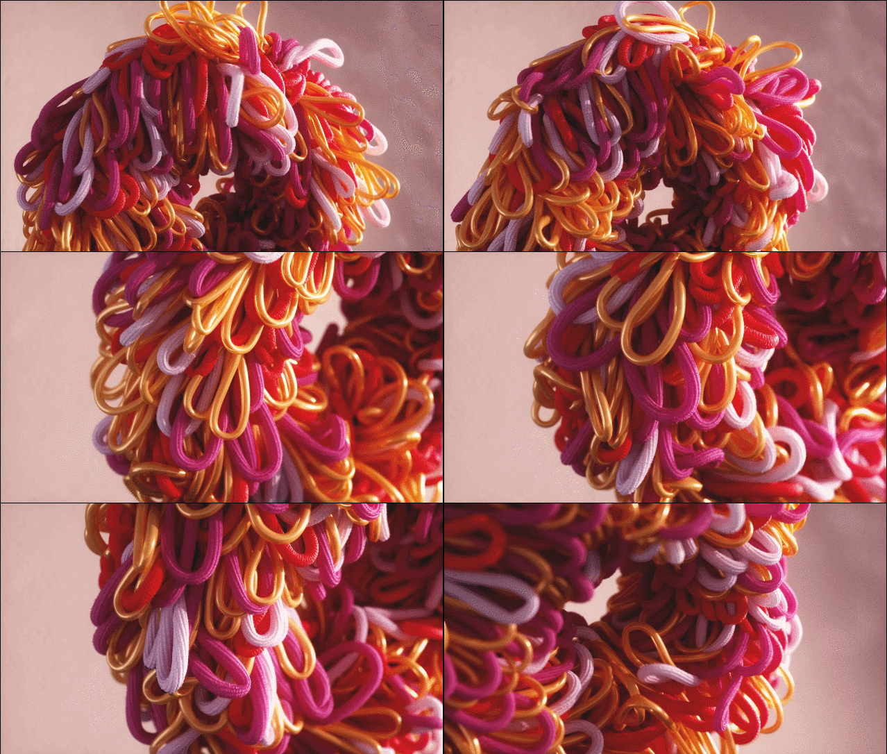
  1. NFT 1 Textile Techniques 01 by zachdarren
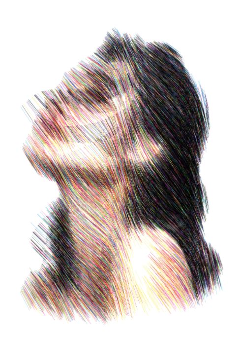
  2. NFT 2 A moment of light. by spongenuity
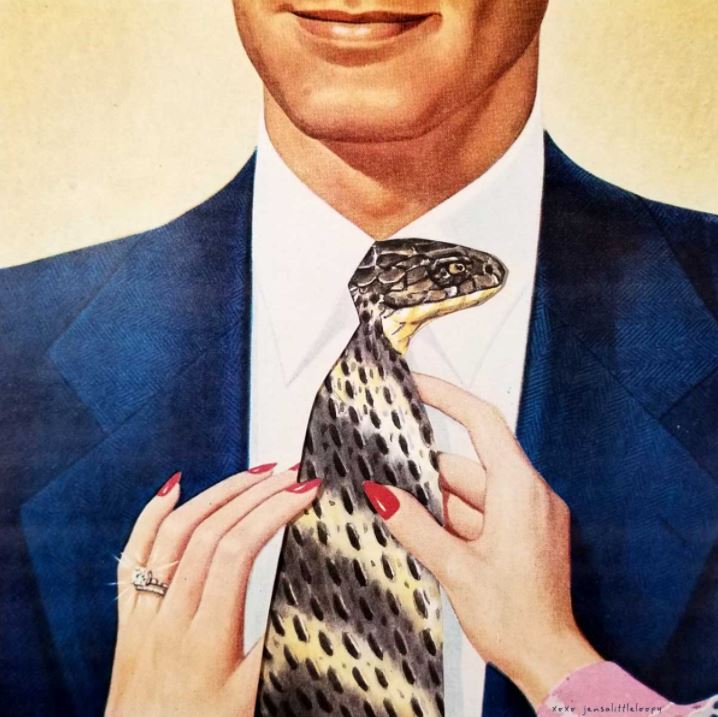
  3. NFT 3 Here honey let me straighten your tie by this person
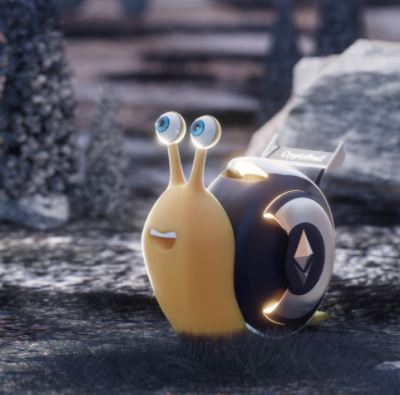
  4. NFT 4 CryptoSnail by @im3dartist

So, words brain is bad right now but I guess we’re gonna do this anyway:

Looking at the endless scroll of NFTs on my screen reminds me of the good ol’ days when tumblr.com was a prime platform for sharing artistic content: two squares of Amazing Content, ten squares of Decent Content, and three squares of content that makes you question why humans possess the ability to create. NFTs seem to take this to an elitist extent in some cases, though, with people selling art that worships the ethereum currency for thousands of dollars and the low, low, price of ecological destruction. In other cases, like hic et nunc, it isn’t so bad, where there’s a digital platform to distribute one’s art but it also is founded upon the use of a digital currency that isn’t ethically, eh, bad. That being said, I doubt hic et nunc has the overall traction or presence that other sites such as foundation have, and therefore the method by which you peruse its art is a bit unrefined, in my opinion.

Who makes this art? Artists. Or, in the case of the fourth work listed above, devout worshippers of online currency that–I’m trying to keep an open mind here–are probably okay-ish people, but like… why do art that is that openly based off the snail from an ill-remembered DreamWorks movie and cites a particular mode of currency that is (despite whatever positive impacts it may have) not environmentally good as a source of hope? I don’t know. The idea of holding any sort of currency in that regard just seems so disgusting to me.

Who goes for this art? I think it depends on which platform one observes. I’ve been told that hic et nunc is supported in part by artists supporting each other’s work, but if we talk a walk over to foundation you’ll see things going for the equivalent of tens of thousands of US dollars, which, I don’t think your average person has to spend on art in a single purchase. Therefore, I’m looking at sites in the tier of foundation as supported by uber-capitalist tech bros who care little about the environmental impact of NFTs, rather than a well-meaning community.
anna-Creature

you can find the sketch here.

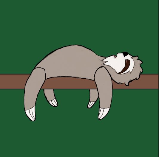
Slothicus Sleepicus

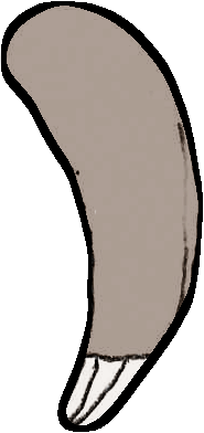
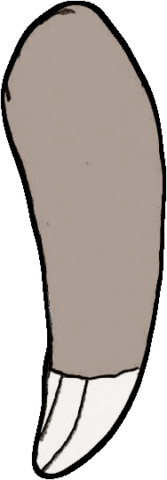
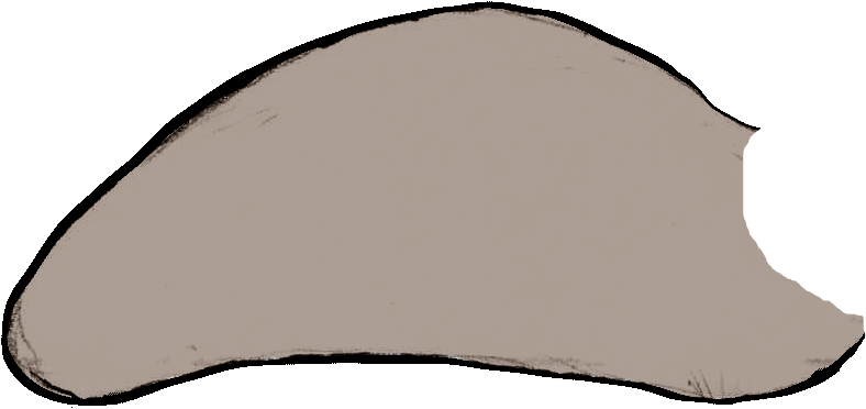
I originally wanted to make a sort of Depression Edition dress-up sloth, as a representation of my depressed self, but eventually pared down the concept into a moving sloth whose eyes open upon audio input. Major thanks to Golan and Connie (and also Paolo Pedercini) for the help! You can see an image and recording of my sketch below:

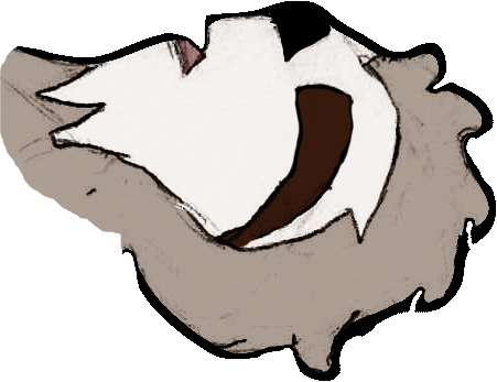
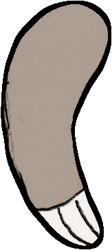
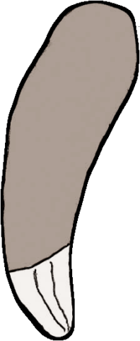
Here are some images of the moving parts I drew and colored for the sloth sketch:

anna-Loop

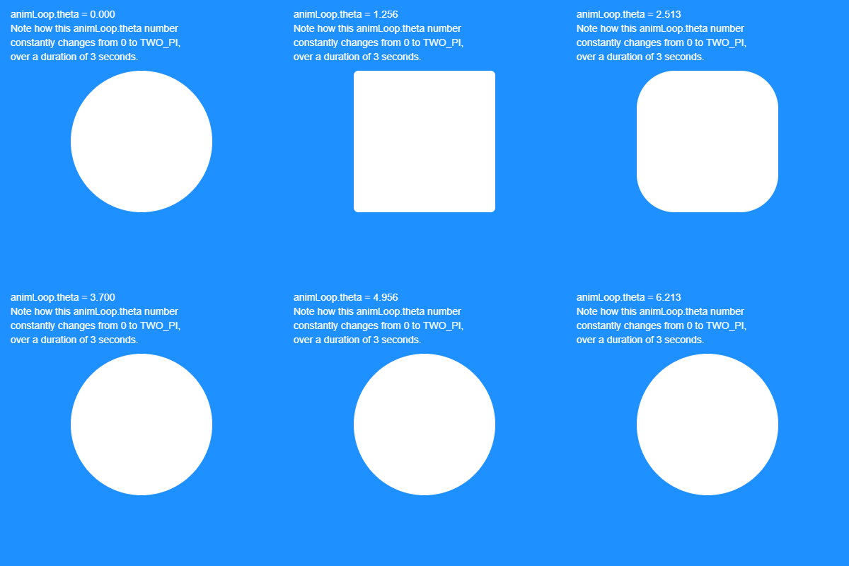
above is my (very subtle) looping .gif, illustrating both an updated version of my response to the combinatoric exercise at the start of the semester and my current mood. My p5 sketch is here.

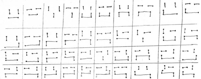
You can see the sketches from my combinatoric exercise below:

Idea-wise, for this assignment, I didn’t really know what to do, so I decided to take a simple illustration that focused on my practice’s themes of emotion and use that expressive quality as a way to tether me to an assignment I was otherwise very empty-headed about, mostly because we’re at That Point in the semester where things are Hard ™ and other stuff with My Brain being My Brain.

I feel like I’m only grasping the surface of stuff we’ve learned in the past few weeks, but this is nonetheless a lot further than I’ve gotten with coding stuff in the past so I’m like, disappointed and proud? Prisappointed? Droud?

anna-LoopResearch

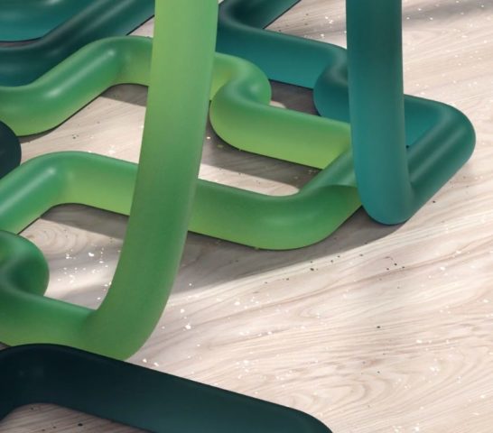
Looking at Bees and Bombs, my first thought is, “How dare this motherfucker have intuitive understanding of the way shapes transform and interact with one another?! It’s too beautiful!”

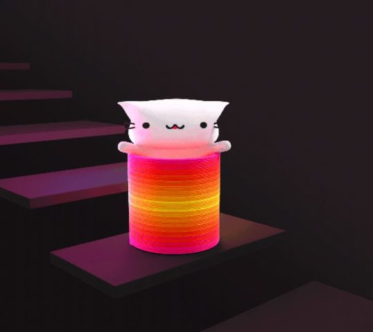
Now, onto Cindy Suen’s work! This is the cutest stuff I’ve ever seen, and I love it so much. Like, I was legitimately Big Sad a minute ago but seeing this amazing cat brought me intense joy, if only for one moment. And it’s the .gif that keeps on giving, because I get to see it over and over again!

Going forward with Andreas Wannerstedt, I was like, “oh, it’s this dude!” because I’m ninety percent certain I’ve seen his stuff before somewhere on my social media feed. I hate the fact that everything is rendered so realistically, because it makes the fact that I cannot live in this world where everything aligns perfectly every time no matter how out of synch it looks just even more devastating.