peatmoss-Dream

Link: https://noonmark.itch.io/hart

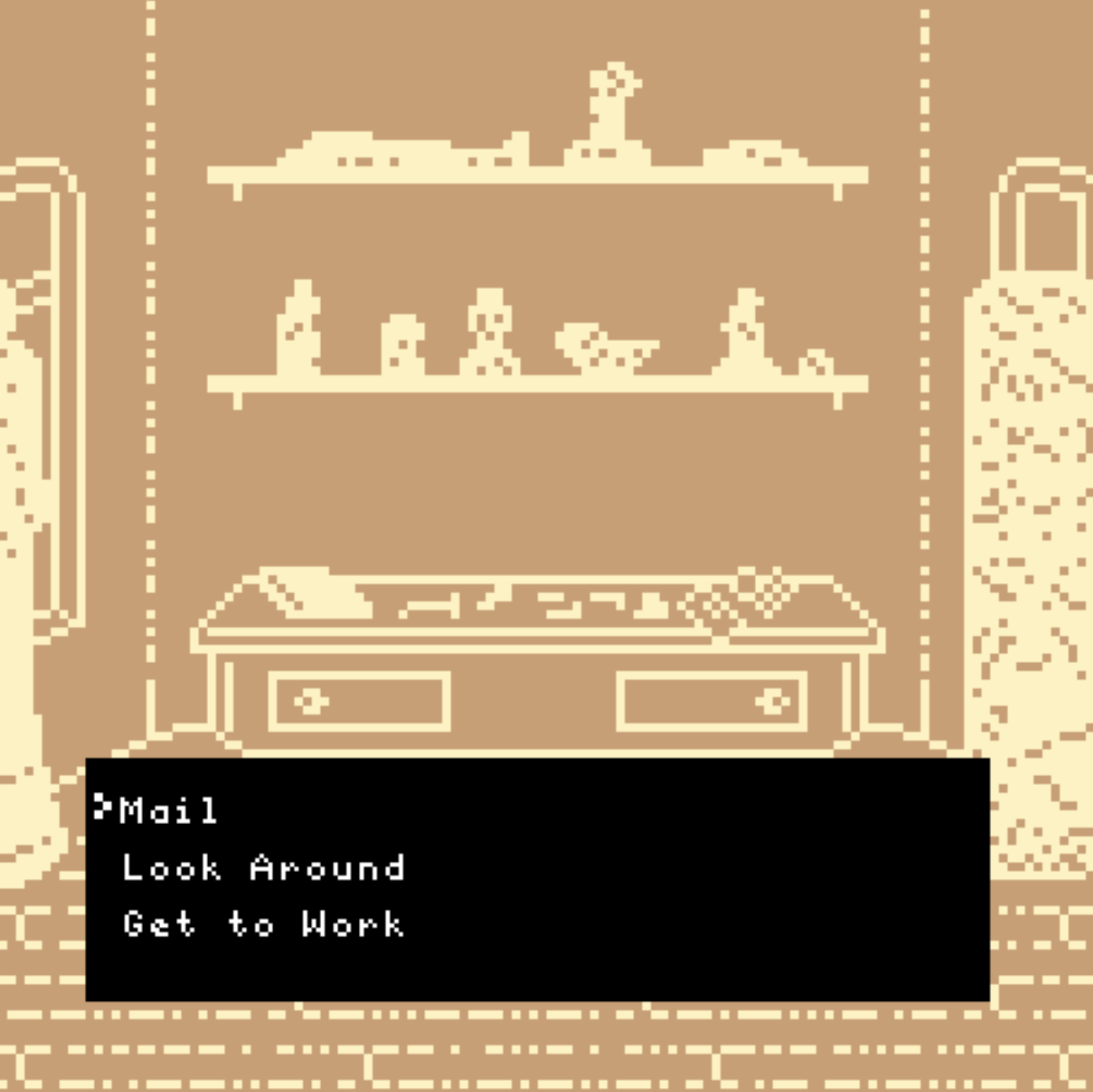
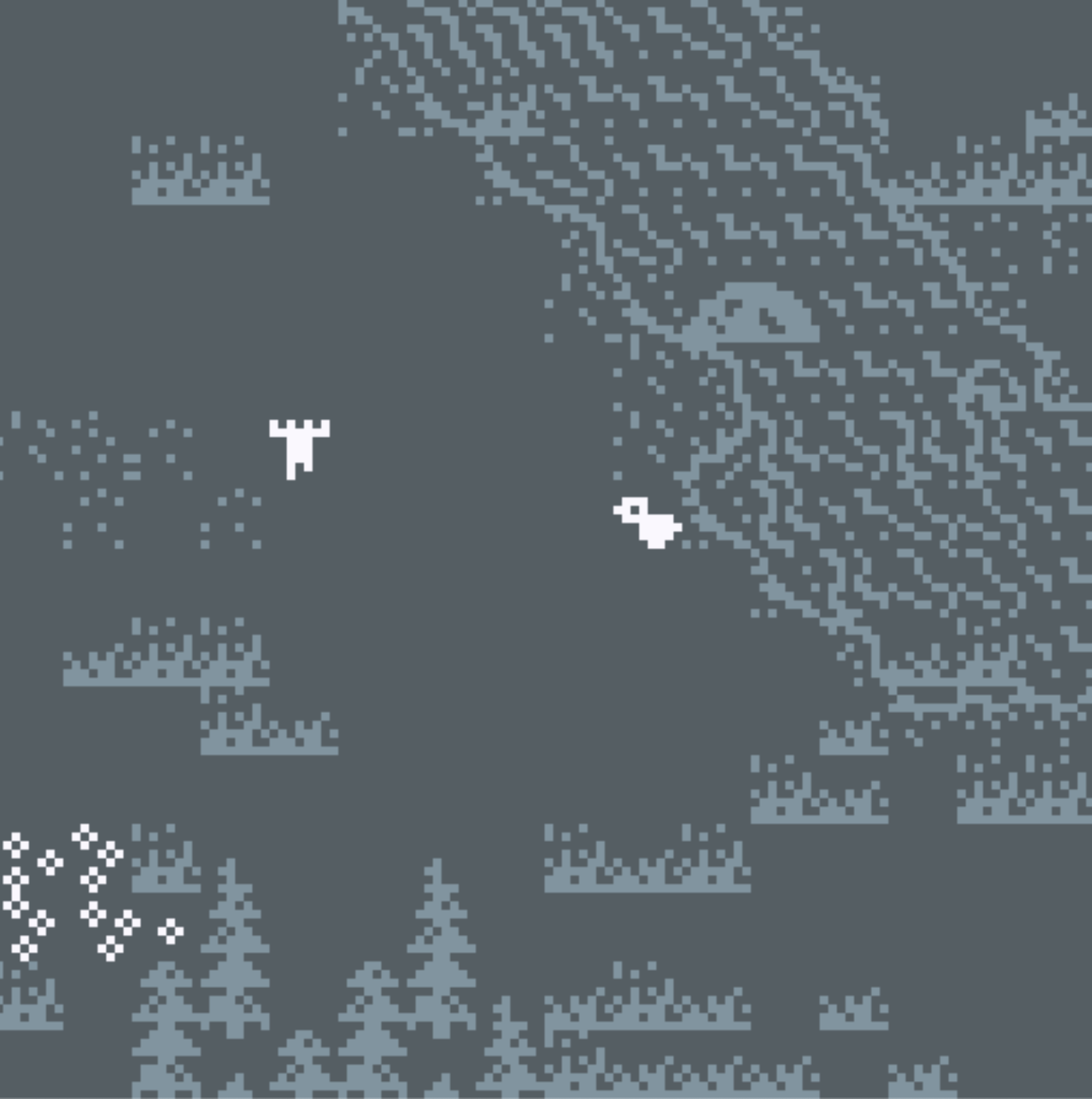
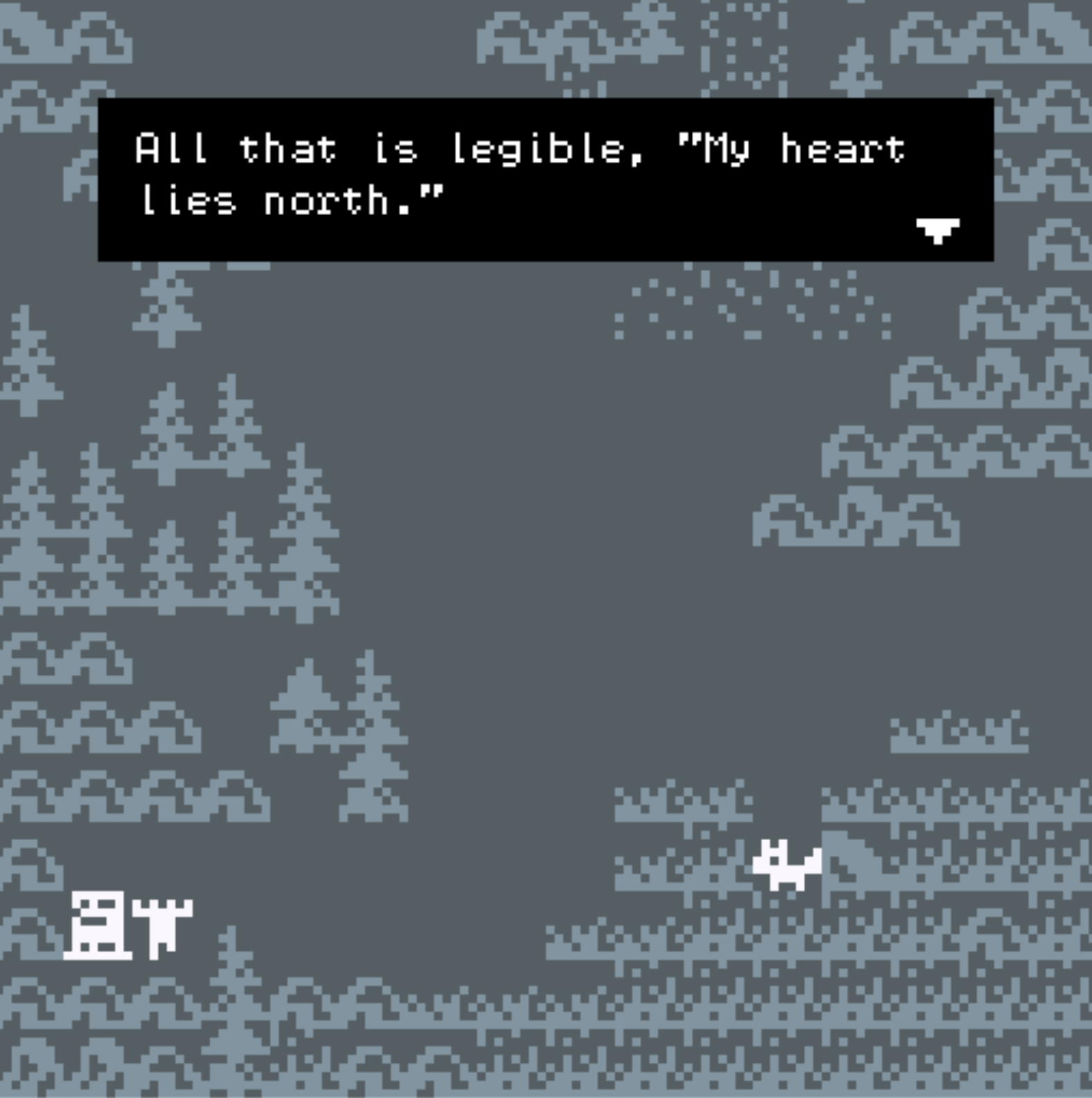
This game is based off an old, old dream I had years ago, which I can’t really remember a lot of. All I can remember is a gathering of small animals on a mountainside and a specific shade of green. This game is an experiment, a first foray into making something interactive. I think there are a lot of things I’d want to do more with, particularly with expanding the environment and “story” or interactions, but this was incredibly fun for my first try. For critique, I’d really like feedback on the legibility of the sprites/artwork, and how people feel the game flows–if the space is too hard to navigate, too “easy”, fine, etc. I’d also be curious to hear what people think of the atmosphere, and the music! I made the music myself using some garage band tools in an afternoon and I’d appreciate some feedback there. Thanks!
 

fr0g.fartz-07_Looking Outwards

Overall, I was very impressed by how creative people are with small pixels. I saw work that was completely different, and it was really cool to see how individualistic people were.

I really liked this project.

It was a story line of somebody mining a mineral and a woman appears in the stone. It was really fun and I felt like I was reading a book, with a pleasing aesthetic and interaction to go with it. The narrative was kind of long at certain points, but I enjoyed it because it was interesting to me that someone cared enough to put such a detailed dialogue.

YoungLee – Looking outwards

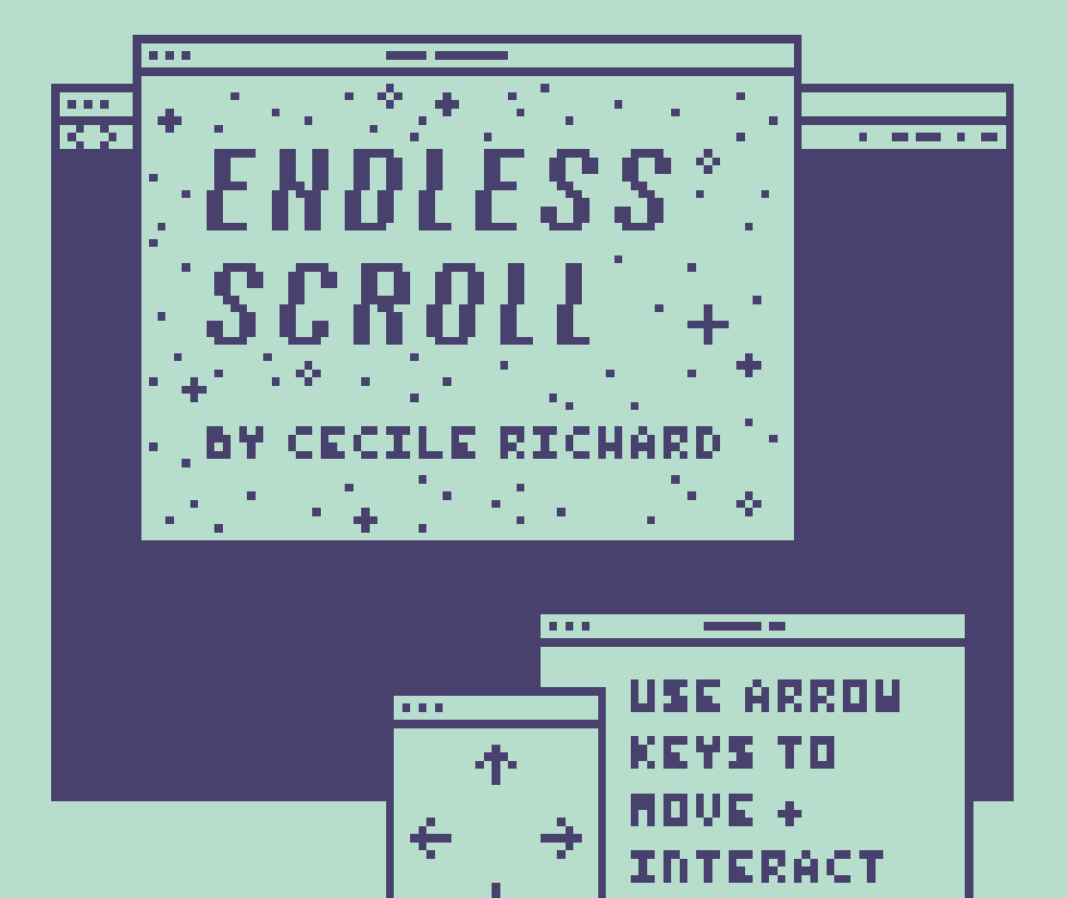
Link: https://haraiva.itch.io/endless-scroll 

Screenshots:


I first clicked the game because the visuals seemed somewhat appealing. I wasn’t really expecting anything, but it had a beautifully written short story about two friends recalling their experiences in high school. I appreciated how realistic the storyline was, and it evoked this weird feeling of nostalgia where you feel sad but in a bittersweet way. I feel excited and inspired to create my bitsy game with its own narrative.

minniebzrg-07LookingOutwards

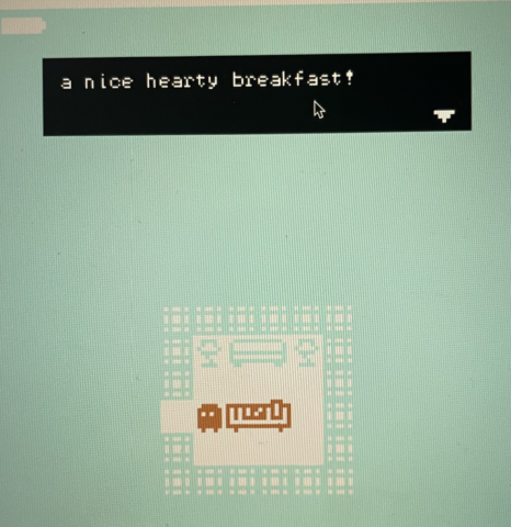
you should eat breakfast by nbckc

link

I found this game because I was hungry and it sounded cool.

Just kidding.

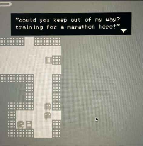
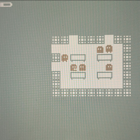
As I began playing, I found this game genuinely intriguing and fun. I think we need more breaks during our day to go to bitsy and play mindless games like this. I like the interactive quality when the character bumps into other characters and stuff like “hey watch it” comes up. Using the direction keys, the player can move around the environment and go into different hallways or rooms. These areas have different purposes or figures. The goal of the game is to find the cafeteria and acquire a delicious breakfast. It took me a good amount of time to find the cafeteria but I think a part of that was because I was interested in the responses of the characters I was bumping into.

I think this game would be super fun if it  generated a new map or a variety of combination of maps.

(Couldn’t screenshot during the game, so these are bad iphone quality photos)

anna-lookingOutwards07

Bitsy! Fun game/narrative making with pixels! That’s what I’m gathering so far. People are making lots of pretty and intricate stuff with only pixels, and I find that cool but also intimidating since I am like, .006 percent familiar with making pixel art in general. Clicked on one and it had sound, which surprised me, but maybe it shouldn’t have. All of these games seem intense, either by like, concept or purely by attention to detail in the visuals. Kinda struggling to find more than, like, five or so on the first page that don’t have to deal with something sad or horror related in their content. Is horror stuff just a thing among bitsy makers? I love the aesthetic, but I could do without any jumpscares at the moment so I don’t exactly have the courage to delve into actually looking at the game.

Okay, there’s one that looks all sunny-ish. Let’s give it a go. Okay, it’s cute but it’s also repeated the same passage like five times so I’m wondering if I did something wrong. Now I’m on a different page, but I have no clue what I’m supposed to do. Maybe my intuition for this sort of thing is off?

Okay! Scrolling through the scary and sad! Aaaand I’ve found… this! I guess it’s cute? Don’t know why I expected it to be more fun than it is so far. I thought it would like, be me having the opportunity to name the fish? But instead I’m a bubble floating around the tank looking at their names like I’m in a gallery. Again, maybe I’m missing something.

bookooBread – LookingOutwards 7

I’m gonna be real honest… I don’t think there was one project that I found I really liked. Personally, I don’t connect with this pixelated style and I found that most of these games lacked depth or were trying too hard to be deep and ended up coming across as cheesy. Most of the time these games couldn’t hold my attention for more than a few minutes. One that I did decently like, however, was Space Rat. It wasn’t trying to do anything deep and was just pretty endearing and fun to play.

I also somewhat enjoyed The Continental Drift because the nature imagery was well done, but I think I mainly liked it just because they played this night has opened my eyes as the background music…

Overall, I think these games are just not really my style, but that’s okay! I am still intrigued and excited to try out how I can make it something I’d consider “my style” or something I can connect with.

shrugbread- Looking Outwards 7

I looked at a few of the bitsy on the links given and landed on two that of my favorites but for two completely separate reasons that are just two of the genres of bitsy games that i’ve found.

The first is Continental Drift

Continental Drift is wonderfully straight forward and unidirectional storytelling that while having very limited user interaction uses the space of the screen for atmosphere and pacing rather than interactivity. The flow of the game works more like poetry with spaces of silence and looking for the next orange tile to progress the repetitive, hollow narration. I find this prose type of poetry or narration to help with the similar yet different visuals. This is my favorite example of the more cinematic bitsy experiences

The other one is Burger City  

A fun story about the protagonist being forced to eat burgers and later imprisoned for not paying the bill. This game is easy to understand and while it has a very low contrast color scheme that can make items hard to differentiate it’s very funny but simple. I think this at least partially exemplifies the more game-ey interactive side that bitsy offers.

Monday – LookingOutwards07

Looking at these bitsy games made me so unbelievably excited for our next project. I really loved  the short narrative games I found, and a lot of them were touching in a really beautiful way to me.  I was especially drawn to the heartfelt, poetic messages and worldbuilding that the two games novena and i had another dream about you last night achieved, and the support and sense of community that they fostered in the community’s response to these games. Others like SPACE RAT and onion detective 2 were much more light-hearted, but still gave me the same hopeful and wholesome feelings as the others did and I really enjoyed the fictional worlds they created.

bumble_b – LookingOutwards07

I spent quite a bit of time looking through the Bitsy websites and playing games. If I’m being honest, as someone who is a big fan of video games (especially the 8-bit variety), I was pretty disappointed with the depth (or lack of depth) of them. There were a few inspired by Mario where you just sorta kept pressing the arrow key until you ran into some coins and got a message that said “You grabbed 1 coin!” over and over again. It got kind of annoying and boring fast. (Although, I really enjoyed the retro design of this Mario game.) AND, I am definitely inspired by the possibilities and the ideas that I have!!!

This game was probably the most enjoyable to me because I love fishing mini games. Of course, there was no actual fishing mechanic; rather, you just pressed the left key over and over again to catch fish. Again, I’m probably expecting WAY too much of these, so I can at least admit this one was pretty darn cute.

I also noticed that some people were making these sorts of plug-ins/add-ons or something? that I really liked, like this Arabic Font one that I would totally use! I’m so excited for the workshop on Wednesday! 🙂