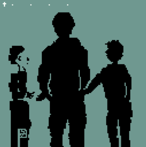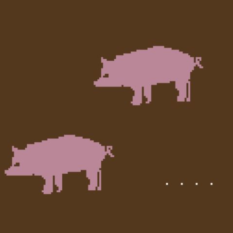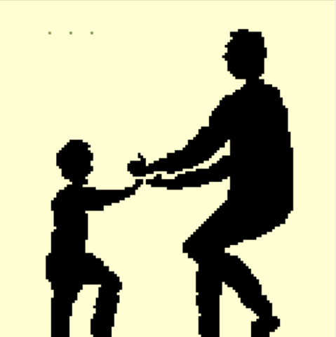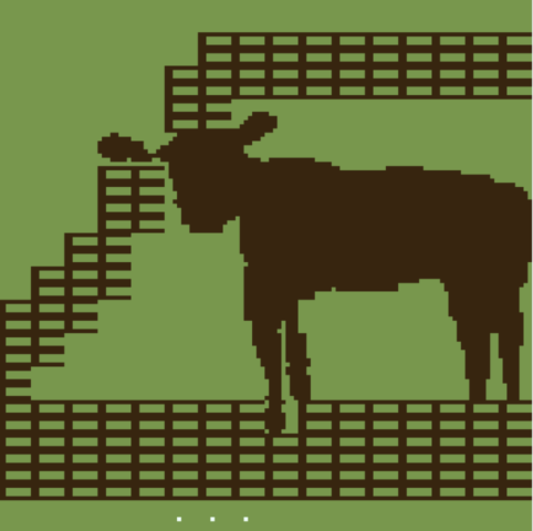


In this bitsy game, the user interacts by pressing the right arrow button. The user experiences a story with each button pressed. The dialogue is a narration of this story. Each scene has an image for the corresponding dialogue.
In my experience making this, I wanted to make compositions filled with different objects, but I resorted to simply making one or two objects per room. When I decided to narrate a story, I wanted images and scenes rather than interaction like a game. That is why I drew images in the rooms. There are times when I felt restricted by the story but I think I was able to go outside the box and add my own aesthetic into the storyline.
Write an answer to the following: In our upcoming in-class critique, what would be helpful for you to get feedback on? What decisions did you make that you’re not sure about?
I’m looking for critique on how to add more interaction and animation into each scene. I want the viewer to interact more with the game. I am also unsure of whether it is too short. I also think I would like feedback on the design and layout of each room. Some rooms feel bare or unfinished.